Busy Bees
Redesigning a double-sided marketplace app for babysitting.
Overview
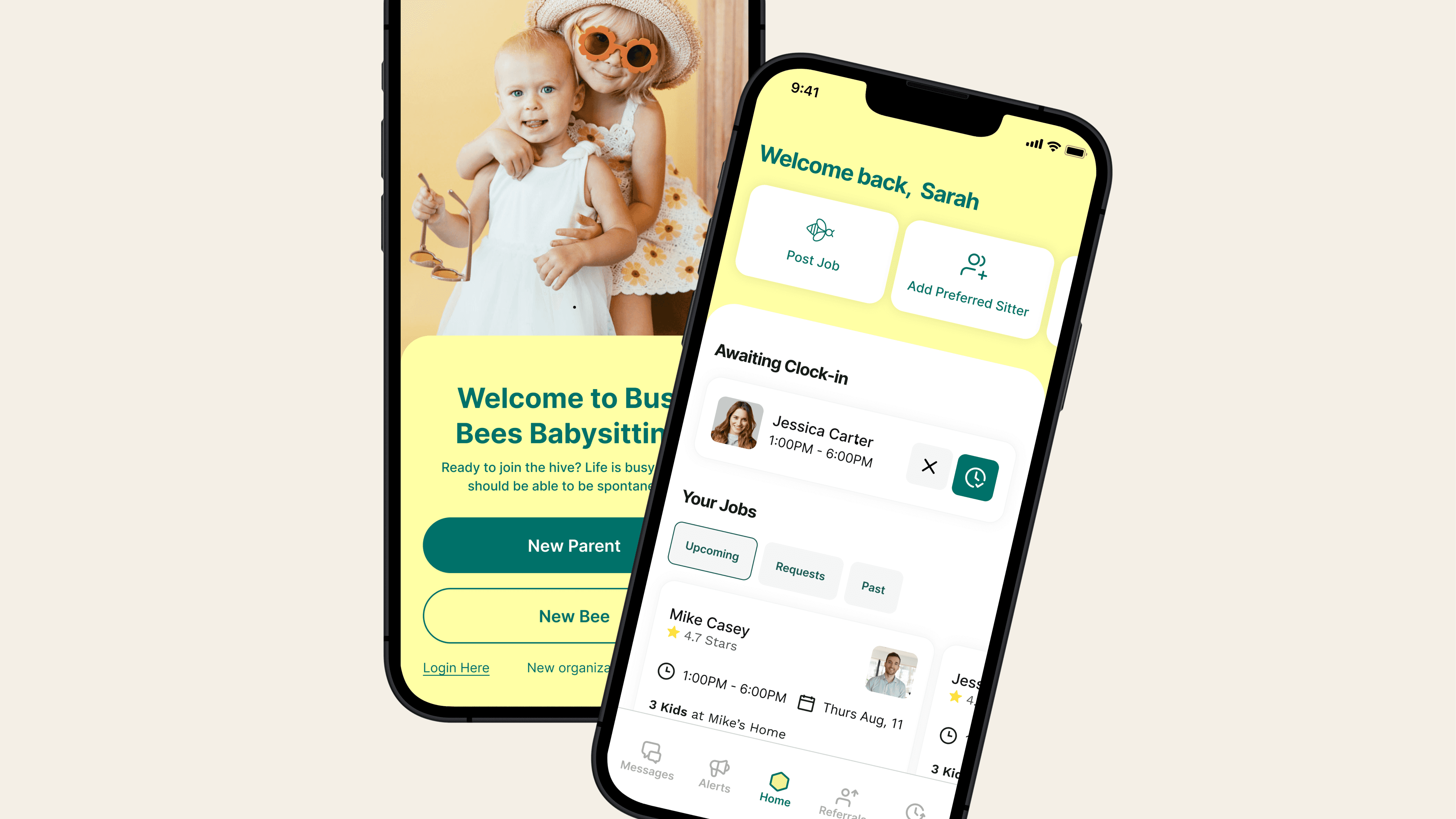
Busy Bees, a Phoenix-based two-sided marketplace for babysitting, connects parents in need of childcare with sitters seeking work. As they prepared for further fundraising, they engaged us to lead a comprehensive app redesign.
Goal
Using the newly created logo, we developed a fresh, playful, and premium app design that preserved the original tone and elements the founder valued while optimizing key user flows.
Outcome
We introduced a new design direction that the Busy Bees team embraced, optimizing onboarding, booking efficiency, job detail scan-ability, and introduced a paid membership.
These helped lead to
5% decrease to churn rate
14% increase in revenue
Services
Design
Strategy
Wire-framing
Prototyping
Leveraging a new brand identity to craft a design direction
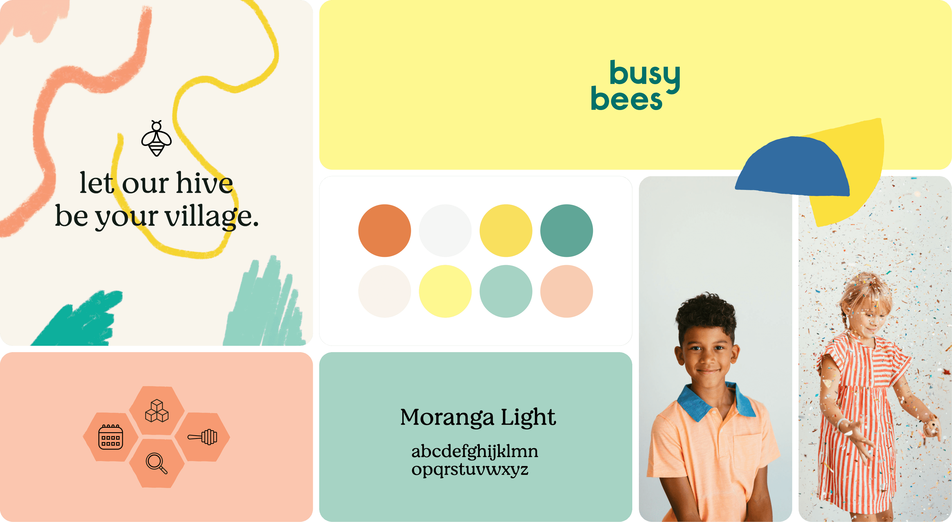
Using Busy Bees' new logo and color palette, we developed multiple design concepts, reviewed them with the team, and aligned on a youthful, playful direction. This style was then applied to key areas of the app for a cohesive experience.
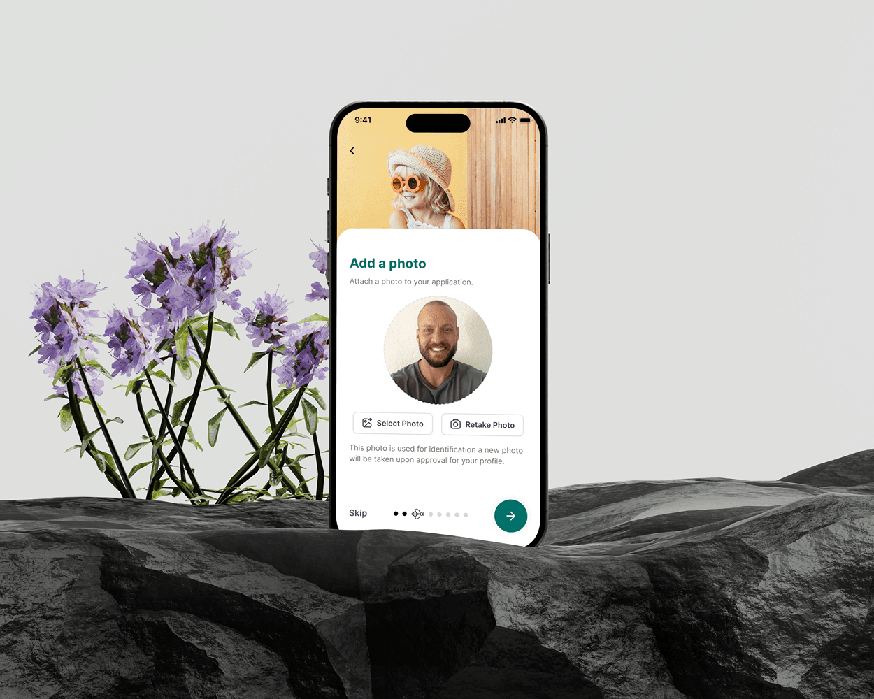
Updating onboarding for sitters and parents
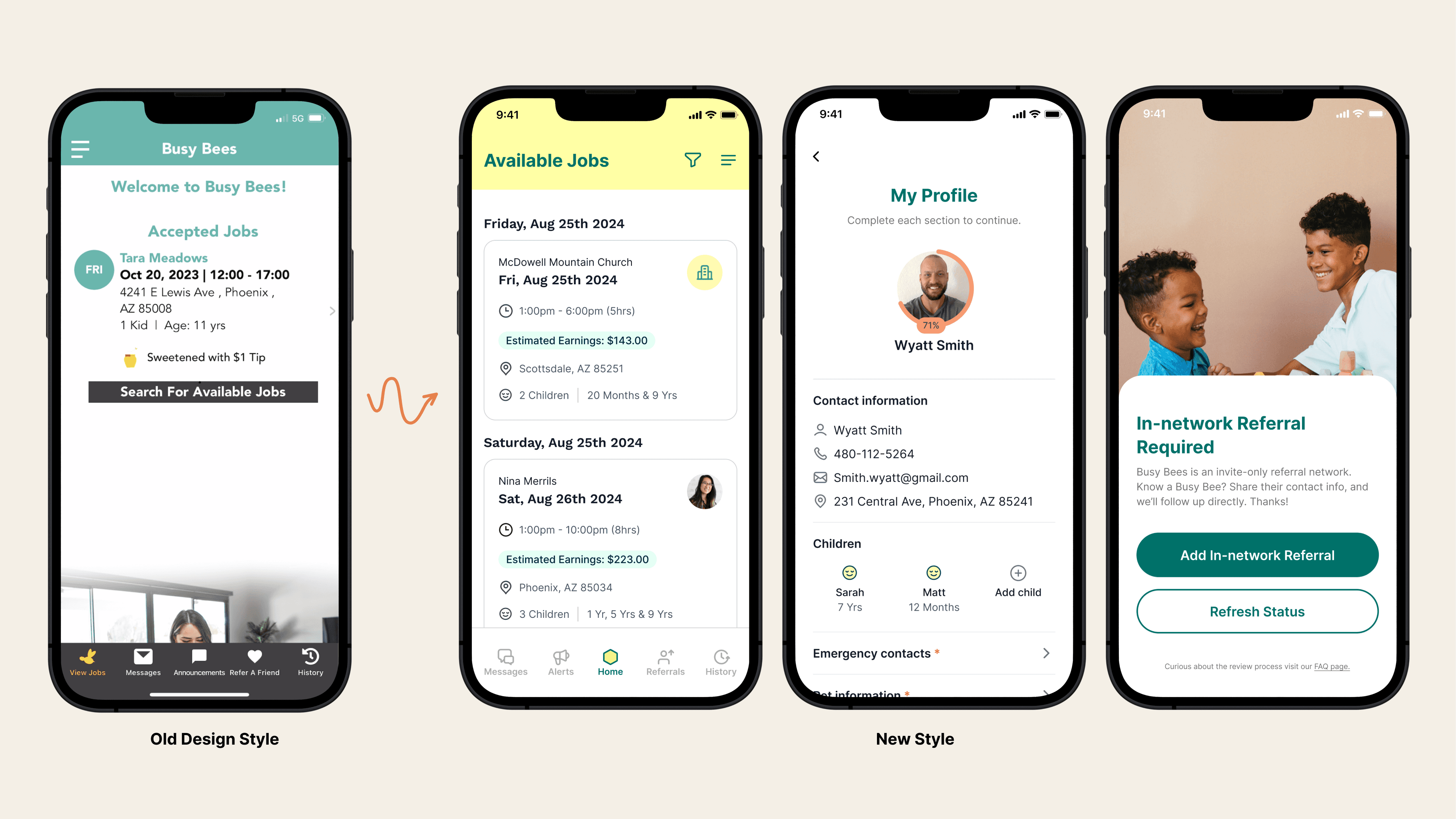
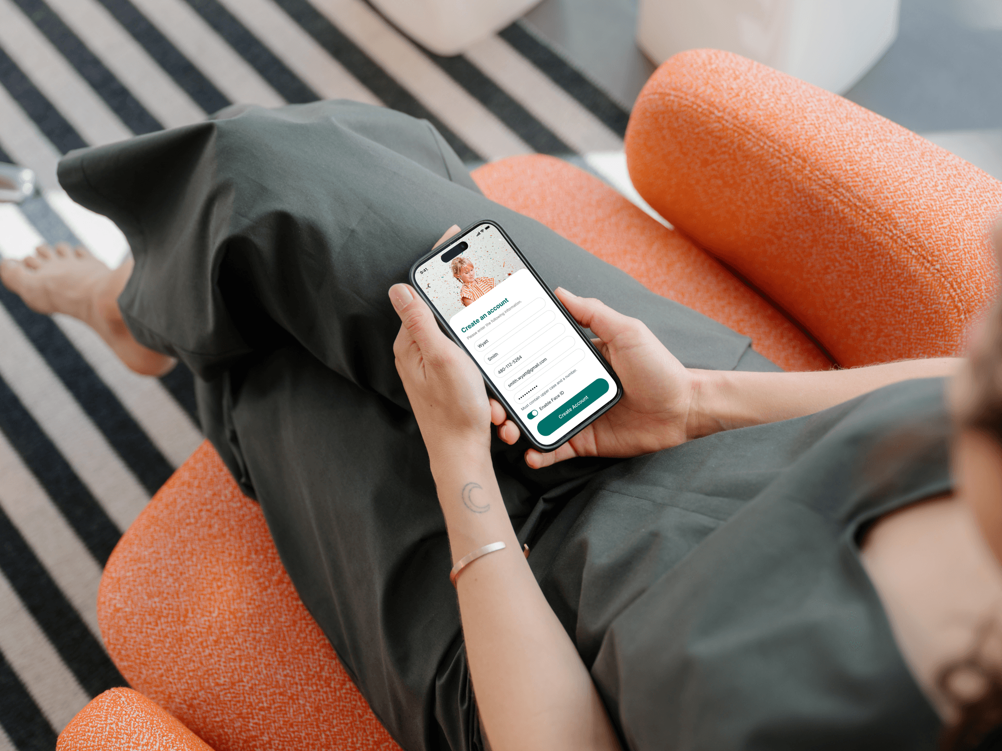
Busy Bees struggled with costly customer support as parents and sitters needed help to complete onboarding. We focused on making the onboarding experience clearer to reduce support needs and improve user flow.

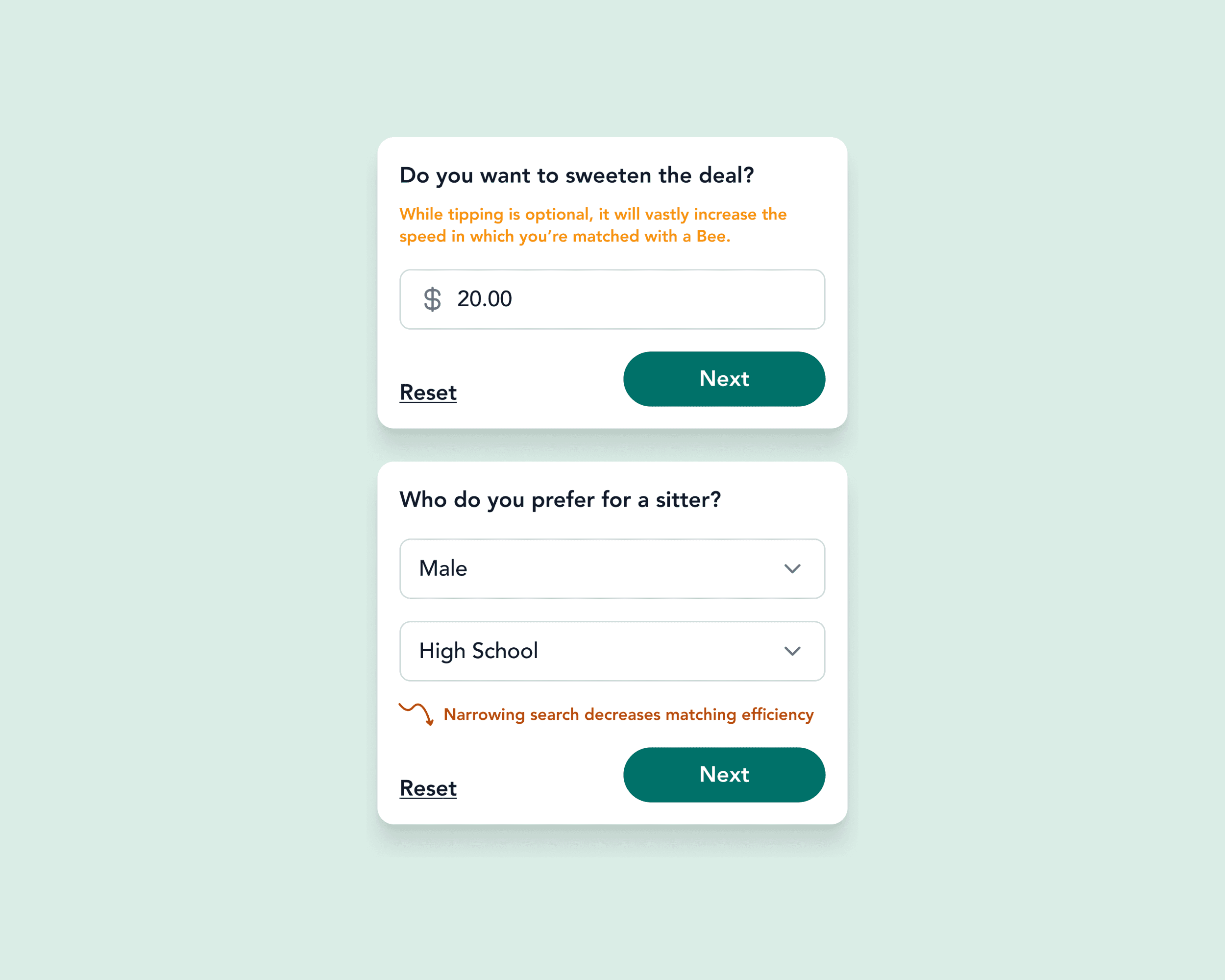
Boosting job success and reducing vacancies with educational tips.
Jobs often went unfilled because parents didn’t understand what made a strong job posting or which factors influenced filling a position. To address this, we added contextual tips to educate parents and set clear expectations.

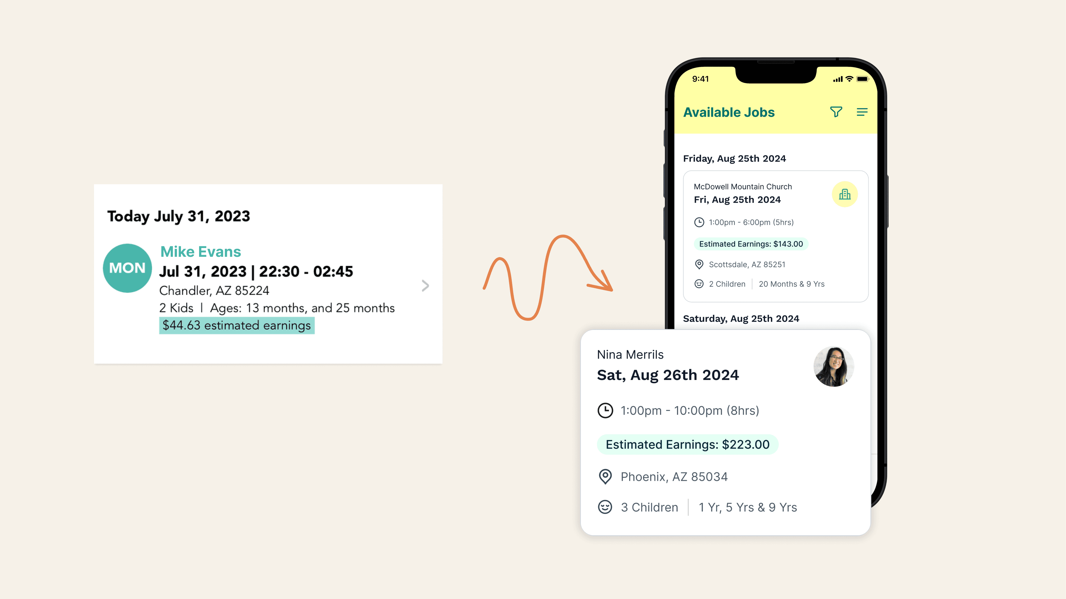
Updating job cards to improve scan-ability
We revamped the job cards to help sitters quickly access key job information. The previous ones had poor design hierarchy.
Busy Bees
Redesigning a double-sided marketplace app for babysitting.
Overview
Busy Bees, a Phoenix-based two-sided marketplace for babysitting, connects parents in need of childcare with sitters seeking work. As they prepared for further fundraising, they engaged us to lead a comprehensive app redesign.
Goal
Using the newly created logo, we developed a fresh, playful, and premium app design that preserved the original tone and elements the founder valued while optimizing key user flows.
Outcome
We introduced a new design direction that the Busy Bees team embraced, optimizing onboarding, booking efficiency, job detail scan-ability, and introduced a paid membership.
These helped lead to
5% decrease to churn rate
14% increase in revenue
Services


Leveraging a new brand identity to craft a design direction
Using Busy Bees' new logo and color palette, we developed multiple design concepts, reviewed them with the team, and aligned on a youthful, playful direction. This style was then applied to key areas of the app for a cohesive experience.
Updating onboarding for sitters and parents
Busy Bees struggled with costly customer support as parents and sitters needed help to complete onboarding. We focused on making the onboarding experience clearer to reduce support needs and improve user flow.


Boosting job success and reducing vacancies with educational tips.
Jobs often went unfilled because parents didn’t understand what made a strong job posting or which factors influenced filling a position. To address this, we added contextual tips to educate parents and set clear expectations.


Updating job cards to improve scan-ability
We revamped the job cards to help sitters quickly access key job information. The previous ones had poor design hierarchy.


Busy Bees
Redesigning a double-sided marketplace app for babysitting.
Overview
Pretzel was an early-stage startup aimed at simplifying the shopping experience. We created a platform where users could gather, organize, and share their purchases or favorite products in personalized collections. Dug Dug handled all of Pretzel's design.
Goal
Using the newly created logo, we developed a fresh, playful, and premium app design that preserved the original tone and elements the founder valued while optimizing key user flows.
Outcome
We introduced a new design direction that the Busy Bees team embraced, optimizing onboarding, booking efficiency, and job detail scan-ability.
These helped lead to
5% decrease to churn rate
14% increase in revenue
Services
Design
Strategy
Wire-framing
Prototyping


Leveraging a new brand identity to craft a design direction
Using Busy Bees' new logo and color palette, we developed multiple design concepts, reviewed them with the team, and aligned on a youthful, playful direction. This style was then applied to key areas of the app for a cohesive experience.
Updating onboarding for sitters and parents
Busy Bees struggled with costly customer support as parents and sitters needed help to complete onboarding. We focused on making the onboarding experience clearer to reduce support needs and improve user flow.
Boosting job success and reducing vacancies with educational tips.
Jobs often went unfilled because parents didn’t understand what made a strong job posting or which factors influenced filling a position. To address this, we added contextual tips to educate parents and set clear expectations.


Updating job cards to improve scan-ability
We revamped the job cards to help sitters quickly access key job information. The previous ones had poor design hierarchy.


Ready to get a competitive advantage?
Book a free consultation call today to learn more about our services.
Ready to get a competitive advantage?
Book a free consultation call today to learn more about our services.
Ready to get a competitive advantage?
Book a free consultation call today to learn more about our services.
Ready to get a competitive advantage?
Book a free consultation call today to learn more about our services.